April 2017 - Present
September 2019 - Present

Manager, Information Architecture, Publishing

I lead the design of editorial tools used internally at the news publications owned by Dow Jones. Our newsrooms: The Wall Street Journal, Barron's, MarketWatch, Mansion Global, Financial News, PEN, Penta.

  • Driving the design of publishing platforms with industry best practices
  • Leading a team of Experience Architects and other designers
  • Providing conceptualization and momentum for projects large and small
  • Collaboration with newsrooms for meeting editorial goals and improving workflows
  • Managing and contributing to our design system and defining consistency in user interactions
  • Collaborating with Directors of B2B and B2C departments, ensuring holistic, company-wide solutions
  • Providing information architecture to publishing products
  • Working on cross-functional teams and encouraging participation among Product, Design, and Engineering
  • Defining, scoping, and budgeting for design projects and initiatives

These are the major tools I oversee:

  • NewsGrid
  • NewsPress
  • Curation

    This is our newest app, currently moving out of our MVP and into a 1.0. Though we've been wanting to build this tool for years, it wasn't until August 2022 that we were given the greenlight and financial support to kickstart it. Our engineering teams were occupied with other work, so we hired an outside agency to make the beta. After 4 months of iterative design and development, we were able to launch with Dow Jones newest brand, WSJ's Buyside, as our pilot in January 2023.

    We're now cleaning up the UI, addressing user experience issues, and adding more features as we prepare to onboard more publications.

  • Image Manager
  • Chartlos
  • Live Coverage
  • [NEW] Newsletters CASE STUDY

    Newsletters have become a major publishing medium for our newsrooms. For years, we used the third-party software Campaign Monitor to build and send them, but we've decided to bring the entire process in-house. This means rethinking how we plan, construct, publish, and send all of that editorial content. And we have multiple kinds of emails going out. There are the standard, editor-written ones, but also automated newsletters with query-based content.

    The PM for Newsletters wrote his Product Requirements Document and I set to understanding what our tools could currently handle, what would take some tweaking to make work, and which needed entirely new tooling structures.

    Everything published by WSJ is first planned in NewsGrid, so we begin there. Eventually, the sked will have a newsletters-specific sked type with ways to track their unique publishing flow. We'll then use NewsPress (a hacked WordPress instance) to do the content editing. This will allow us to publish our newsletter content to the web (as an article), which today we don't do.

    After we established this flow, the PRD expanded in scope. We needed to incorporate the automated emails into the flow. This meant deciding where the final Publish action happens. For articles, that's with a button in NewsPress. But the workflows around sending automated emails do not belong in NewsPress.

    I mapped out a number of possible flows for how editors might move through our tools to publish all of the additional newsletter types.

    We know we will need to build multiple views for handling the various needs of Newsletters. What we have not yet worked out is where those those views will permanently reside. We have three options: 1) build a new Newsletters tool, 2) build these features into NewsGrid, or 3) build these features in the Curation tool. We're leaning towards option 3, and so I've begun wireframing how this might look.

    Newsletters distribution is a completely new workflow for our internal editorial tools. The design process has not been exactly straightforward.

    Our first step was to take what we know we need to replicate from Campaign Monitor and construct a workflow and UI to handle all of those elements and tasks. My report, Misa, has been in charge of newsletters at Dow Jones for years, so his expertise gave us confidence we were hitting all the necessary notes. Product Managers reviewed this work and loved it.

    Then we brought it to the engineers who would be building it. They had concerns. If the Newsletters workflow was to be built in the Curation tool, why did it share only 50% of the UI structure? Why not 100%? Good point! The answer was that we were streamlining the flow for the user and trying to reduce the number of views and clicks to a bare minimum. That's fine, but we also need to have maintainable software with reusable patterns. Sometimes that need takes precedence, and our engineers were right to point that out. So we adjusted the layout to support an easier — and less costly — build.

    After that, we shared it with the engineering team responsible for managing the complicated flows of data through our tech pipelines. They also had reasonable concerns. For instance, our concept of pairing newsletter type with article within a view wasn't going to satisfy the delta requirements. We need our users to first select the Newsletter type, and then attach the article (newsletter copy) to it in order to create a verifiable campaign. This broke the campaign creation step into two views and added a click, but the work flow itself remained relatively identical. Follows patterns we've used before, and required no new design system components. Success.

    All in all, our original concept ended up more or less fully intact. We made some errors with respect to engineering needs, but those were easily solved. I choose to be flexible as a designer and to take into account the needs of all of our stakeholders. That's how sustainable tools are built, ones which can last a decade or two, and not just an org cycle.

  • Transcription [Beta]

    A tool which makes textual transcriptions from uploaded audio or video files. Because much of the notes collected by our reporters contain extremely confidential and sensitive content, they rarely feel safe using the third-party services which offer transcription. We built a beta for this tool, which dozens of reporters are currently using, and hope to one day make this a top tier app in our suite. There are a lot of time-saving and content-creating features to be gained from it.

I also own and manage the design of our self-built design system:

  • Screentone

    The infamous button view in every Design System ...

    I lead the design of our self-built site for documenting the system.

    That site is where all of our official documentation lives, and the code documentation in Storybook.

Other projects and initiatives:

  • Header and Navigation Redesign

    Between 2018 and 2020, we rebuilt each of our major editorial tools with our homegrown design system, Screentone. While each tool had properly used our header components, we had allowed them to include links and icons suited to their own needs. The diversity allowed us to learn what was beneficial and what wasn't.

    We now have a plan to unify all of our tools into a single application, and the first step towards that is a Universal Header. A single header which meets the requirements of all of our tools at once. Once all the tools are using the same header, we'll be able to merge them, allowing users to navigate smoothly between them.

  • NewsGrid Sked Card Redesign

    These are the cards which appear accross tools and are objects representing stories (technically "skeds" in newsroom parlance). In many places they can be dragged 'n' dropped, or rearranged by order.

  • NewsGrid Asset Cards Redesign

    On a story sked (detail page for article info), these are interactive components which represent assets which could be used in the article.

  • Newsroom publishing workflow

    To better understand how our newsrooms move through our tools to get a story from conception to publication, I mapped out the general flow.


January 2017 - September 2019

WSJ.com

From January 2017 to September 2019, I was a product designer for the Wall Street Journal website and mobile apps. I began on a 3 month contract as a front-end designer, building protoypes of the new iOS app and establishing the first Design System for WSJ digital products. In April of that year, I joined full time.

Some select projects:

  • Live Coverage [Case Study]

    Case Study

    Live Coverage

    We recently rebuilt the new Live Coverage experience for the Wall Street Journal. I had pushed for this for years. As someone who really loves a blog, the old presentation for our live coverage really bugged me. The layout of the page had struggled to properly convey the immediacy of the reporting, or to even feel live. The page heading itself was about 2/3rds of the page. Or well passed the viewport height if there was an image. The first post looked small and insignificant, sandwiched between a Top Posts widget and an ad. This particular product was begging for an update.

    In summer 2019, the newsroom started looking ahead to the reporting of the 2020 U.S. Presidential Election primaries, Live Coverage finally landed on the product roadmap. I was ready. And the timing happened to be perfect for me, as well. I had just moved from working on the reader-facing WSJ products to the newsroom tools team. This meant that I was well positioned to design the new Live Coverage page, and to also design the new publishing tool for it.

    It's rare for a custom CMS to be designed along with a new publishing product. It's usually either something like a Wordpress install to hack together what the front-end needs, or it's a front-end designed around the limitations of the CMS. This is especially true for products in legacy media as old as the WSJ. Roadmaps don't often come together like this with newsroom needs timed so perfectly with engineering availability. The Live Coverage product fell right into this sweet spot.

    I made sure to take full advantage of it. Because we were prioritizing a mobile-first experience, the tool could present a new post beside a stream of what's already been posted. A reporter or editor can write inside a high fidelity WYSIWYG field while also having what's been published right in view.

    We also introduced a couple brand new concepts to our Live Coverage reporting: a Featured Post position for presenting highly valuable context for the content stream below, and a Primary Media position for sharing a map, chart, or image that is integral to the event. Here is the page in the tool for posting to these locations, with little illustrations for reminding editors where that content will appear.

    And here is a design for a Live Coverage event, with everything in place. You can see that the content hierarchy establishes priority in the order we wanted to stress. The most recent post is top left, and about 2/3rds of the page width, large and prominent. A Featured Post takes that place if there is important context editors want to stress. The page-level meta info is packed into a small box on the right, with Primary Media content just below.

    Another brand new feature we built into the tool was the ability to have Pre- and Post-Coverage views of the page. For SEO and link-sharing purposes it helps to have a live URL ready to go well before the event begins, and the page itself makes clear when the event coverage is going to start. When the event is over, the page displays that explicitly, as well.

    The tool works really well. We've had a great response from our editors. What's even better than praise, though, is seeing our Live Coverage reporting increase in amount of coverage posted, and a much greater frequency of Live Coverage events being created. The icing on the cake is hearing that for the period between the 2020 election and Biden's inauguration, the Live Coverage pages were getting page views rivaling those of the WSJ.com homepage. Not only that, but the live coverage page views for the first three weeks of 2021 have already beat the entire amount of page views for live coverage in all of 2019. It's absolutely time to call this project a huge success. I couldn't be prouder to have worked on it, nor to have been a part of the great team who brought it to life.


    More Views

  • WSJ.com | Markets [Case Study]

    Case Study

    WSJ.com Markets

    Our agile process at the WSJ means we are continually updating and redesigning the parts of our product which need attention. One of the highest trafficked pages, and the longest neglected, was our Market Data Center. The pages were so old they used headers, footers, and color palettes we've long since retired elsewhere on the site. We also knew we weren't leveraging the provided data to their full potential. Many pages and useful tables were buried and hard to find. And so, with new editorial guidance and support, we set to updating the interface and the experience.

    You can see for yourself how uncoordinated our tables and charts had grown to become.

    These were spread across dozens of pages, lost among navigational chaos. This is where the UX research work began. Who was using this data? How often? Did we have outdated tables which were no longer needed? Was there any data relevant to our readers we weren't providing? Our UX team diligently went about collecting answers from our subscribers.

    As for interface design, I set two primary goals for the tables and charts: 1) that they maintained a strong visual coherence between them, and 2) they would look at home on any WSJ.com page they might be used. I began with the smallest elements and worked myself up into fuller compenents. For accessibility, I set the table text size to 16px and added as much margin I could get away with. We already had a color palette in our design system, which gave me proper guardrails.

    What I ended up with was fully on-brand, felt consistent, and was flexible without being constraining. Before long, any new component needing designed was falling into shape without any new patterns or type treatments.

    I also had the good fortune of spending some time with the designer of the Retina typeface, Tobias Frere-Jones. He assisted with some Retina-specific word-spacing, and he revealed hidden alternate figures such as a numerate negative symbol and a syntactical-descriptive colon drawn specifically for data like ours. Retina was designed for exactly this type of content, so it was extremely fun to dive into.

    We now have a robust system for developing any table we need now or might need in the future.

    We structured the Market Data pages on the same 16 column grid we use across WSJ.com, including our 4 column right rail for secondary content. Keeping the right rail unchanged provided us with two benefits. We could use the same advertising slot sizing we already use elsewhere. And any new Market Data component we build would fit on any other page if we decided to do so; other pages like the Markets section front or Economy articles.

    Once this structure was in place, the pages were easy to lay out. We took the learnings from the user research and listed out each and every table which belonged on the various pages.


    More Views


  • New iOS app, launched in 2017
  • Breaking News Banner

    Updated the top-of-page banner to better match the WSJ Design System, and to work responsively.

  • Tappable Stories

    A custom wsj.com article type which used the new tap pattern established by Snapchat and Instagram.

  • Article Share Tools & Settings

    A self-initiated project. I didn't think the large, round, colored circles matched the brand style we were establishing online. Too cartoonish. Before, all share tools and article controls were stacked in a slim left-rail. I split them for user clarity. The share tools remained in that left-rail, while the article controls were moved to the main content area, closer to the text they affected.

  • Article Collection Tile Layout Page

    Editors wanted a visual way to collect and display articles with strong images. We built this for them in 2018

  • User Commenting on Articles
  • 2018 Olympics medal counts
  • Fullscreen Image Slideshow
  • Image Slideshow component
  • WSJ Video Featured Series
  • New WSJ.com homepage (unlaunched)
  • WSJ Exclusive Article branding
July 2015 - April 2017
Freelancing

Dow Jones

Front-End Designer working on Wall Street Journal projects

  • Built html/css/js prototypes of new iOS views
  • Initiated a design system for quicker protoype building. This was the beta for the first official design system made for WSJ products which I later helped build out.
  • Design work for the new iOS app under the lead of the Design Director.

The Barnes Foundation

Design and development of microsites for various things. Each built with Squarespace.

  • Exhibition event: Person Of The Crowd.
  • Barnes Classes.
  • A donation page give.barnesfoundation.org (now offline)

The Dot Blockchain Music Project

Design of the alpha release for this potentially industry-changing app for anyone and everyone working in music. Dot Blockchain Music. Read Benji Rogers' write-up on Medium. Winner of the 2016 Musically award for Best Music Startup (B2B)

  • The beta designs for the DotBC Music application.
  • The beta designs for the DotBC Music public-facing site.
  • Designed the public page for potential new parter sign-ups.

CardStack

  • Sub-contract work for Acquia: UX/UI design and front-end development for an as yet unannounced, unreleased product.
  • Sub-contract work for the new AIA.org (The American Institute of Architects): front-end development and some minor design. (We also designed and developed a brand new CMS during this project, which was planned to have an open-sourced release.)
  • Development of the CardStack website.

Portigal

  • Design and development of Portigal.com for the very knowledgable and very kind Steve Portigal.

Tendr

  • Mailchimp email template design.

Run or Pass

  • UX consulting for an iOS app for football fans.

Alice & Fain

  • Album art design for Be Still EP.

Hillary For America

  • Volunteered a dozen hours working for the campaign design department. Mostly designing the PayPal integration into their donation flow.

January 2014 - July 2015

Web and Product Designer

I was the sole designer on the internal tech team at the museum. I also helped with a significant amount of front-end engineering, and created two design systems, one for the app and another for the website.


Ask Brooklyn Museum

A digital docent experience within the museum. I lead the design of the app and the user experience.

  • Ask iOS app & tool CASE STUDY

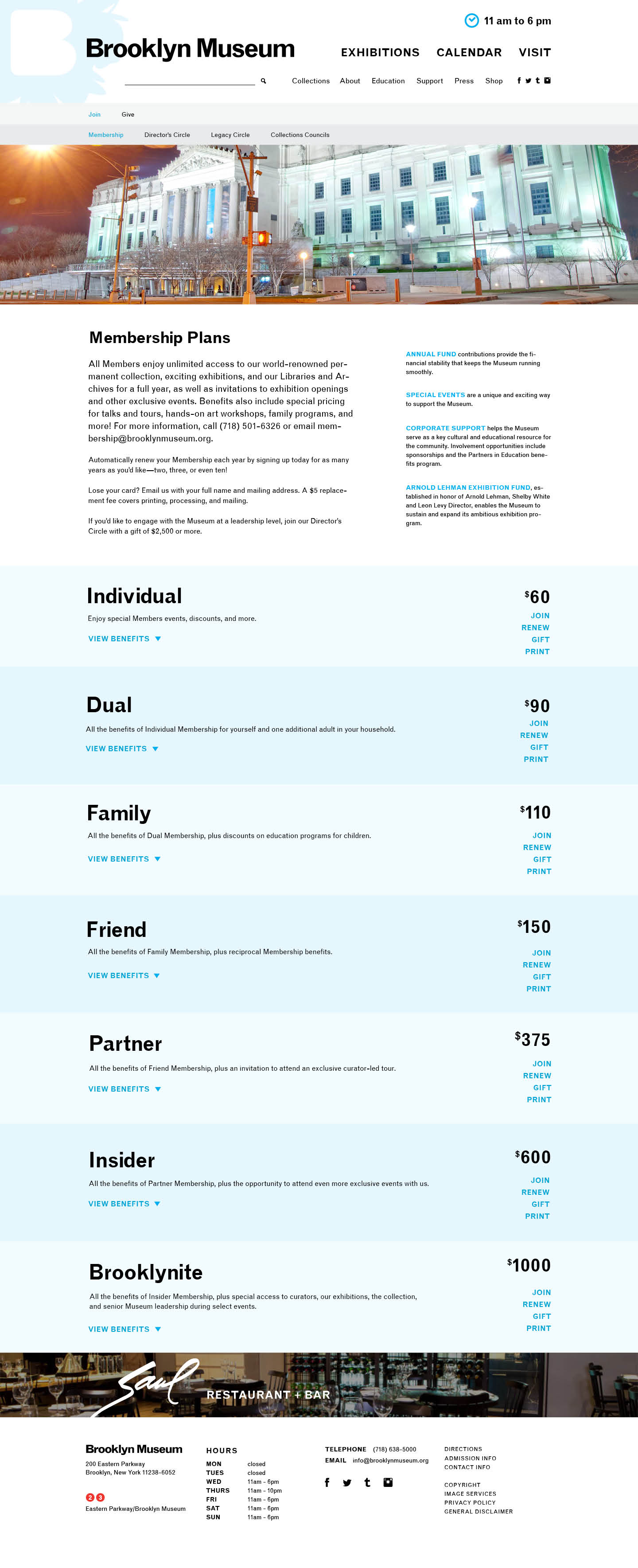
    Though my official title at the Museum was 'Web Designer', I worked on a variety of different digital products, all under the umbrella of the Bloomberg Connects project funded by Bloomberg Philanthropies. The full scope of the project was intentinally left open, but there were a handful of elements we always knew would be included: a new iOS app, a web application to work in tandem with the iOS app, new digital signage for the lobby and galleries, a CMS migration and refresh of the current website, and then a full website redesign a couple years later. The second, more involved website redesign would deeply integrate the data and content we will have gathered from the Ask program.

    We started with a mission statement:

    To create a dynamic and responsive museum that fosters dialogue and sparks conversation between staff and all Museum visitors.

    What we built would be an ongoing discussion, something to be worked out over the course of years. The one thing that would not change was our commitment to the Museum visitor.

    Ask Brooklyn Museum

    We branded the project Ask Brooklyn Museum. A name which hopefully conveys a sense of friendliness as well as a call to action. What we're building is, at its core, very different than what any other museum has done with tech. With our iOS app, we are giving our visitors the ability to ask questions of our staff during their visit, and we will answer them in real time. Our Audience Engagment Team will be situated in the lobby of the Museum, using a web app which allows them to reply.

    The iOS App

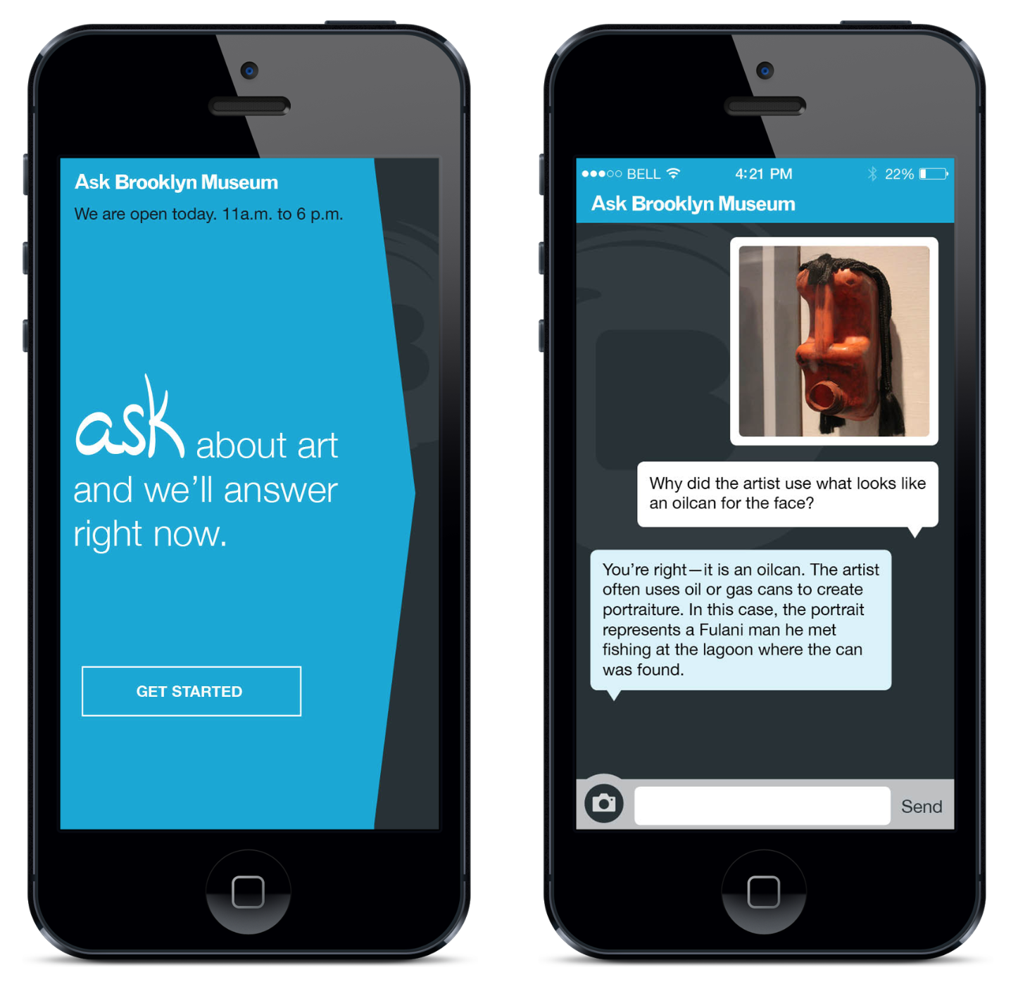
    The iOS design should look familiar. We used iMessage as a mental model so that users would feel immediately comfortable using the app. We found it difficult to explain the novel purpose of Ask to our testers, but by presenting them with a recognizable design, they had no trouble sending in questions. Mimicing iMessage may have been a boring design decision, but it's intuitive for the users, and at this stage of the project, our main objective was to get people asking questions quickly and without hassle. That's been a huge success.

    For release version 1, we've kept the app extremely simple. There's a landing page with a brief descriptive message, and a button which takes them into the chat view. And that's it. Future versions may allow users to view more basic visiting information, exhibition info, and event listings. In beta versions, we actually did include those features, but our visitors mistook their existance as the primary purpose of the app no matter how deeply we buried them in the navigation. The Ask concept is too new for the average visitor to grok right away. They were far too willing to assume our app wasn't any different than their conceptions of others museum apps. That being said, our visitor reviews have been overwhelmingly positive and we're excited to see how the public accepts the new direct access it provides to the Museum and it's staff.
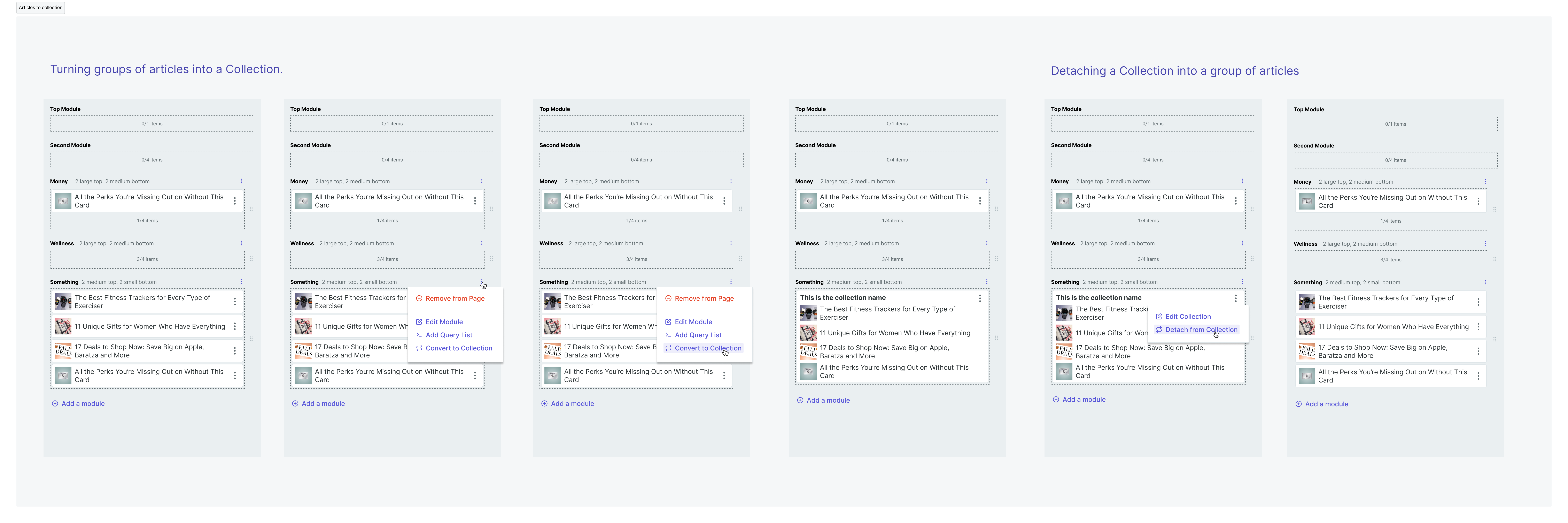
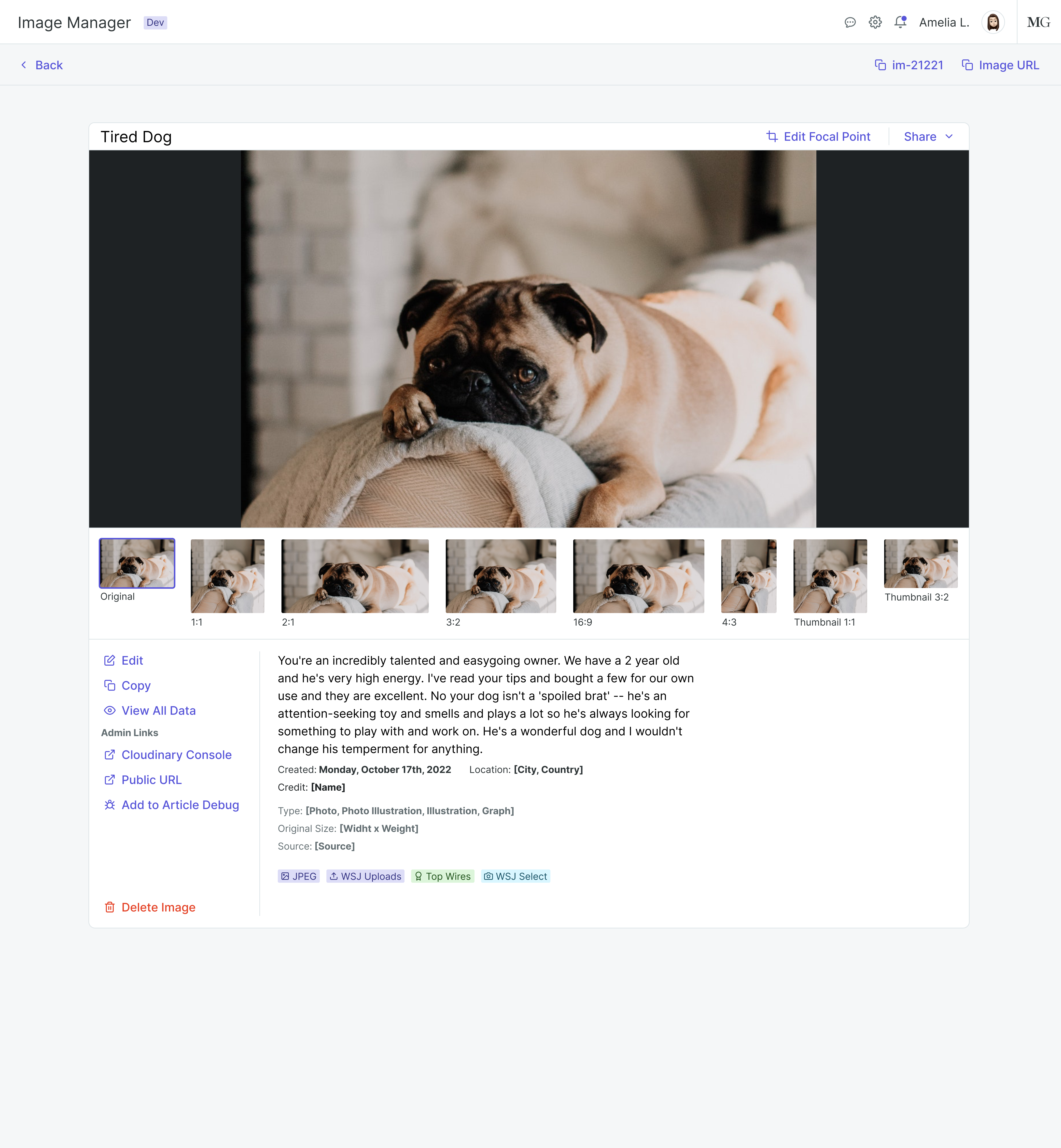
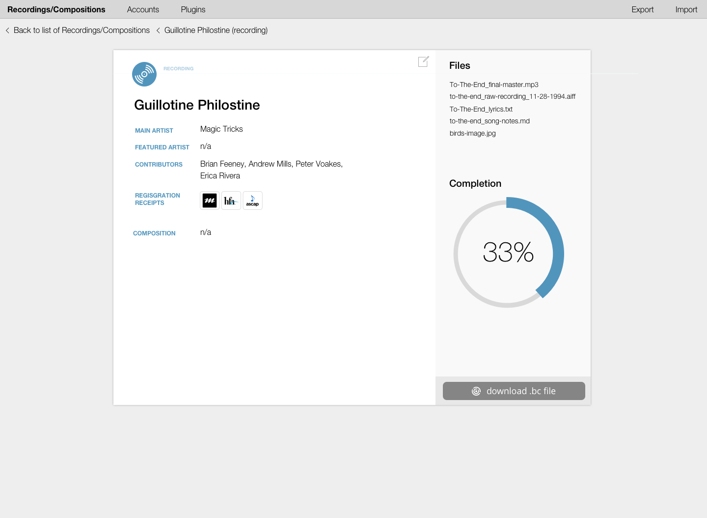
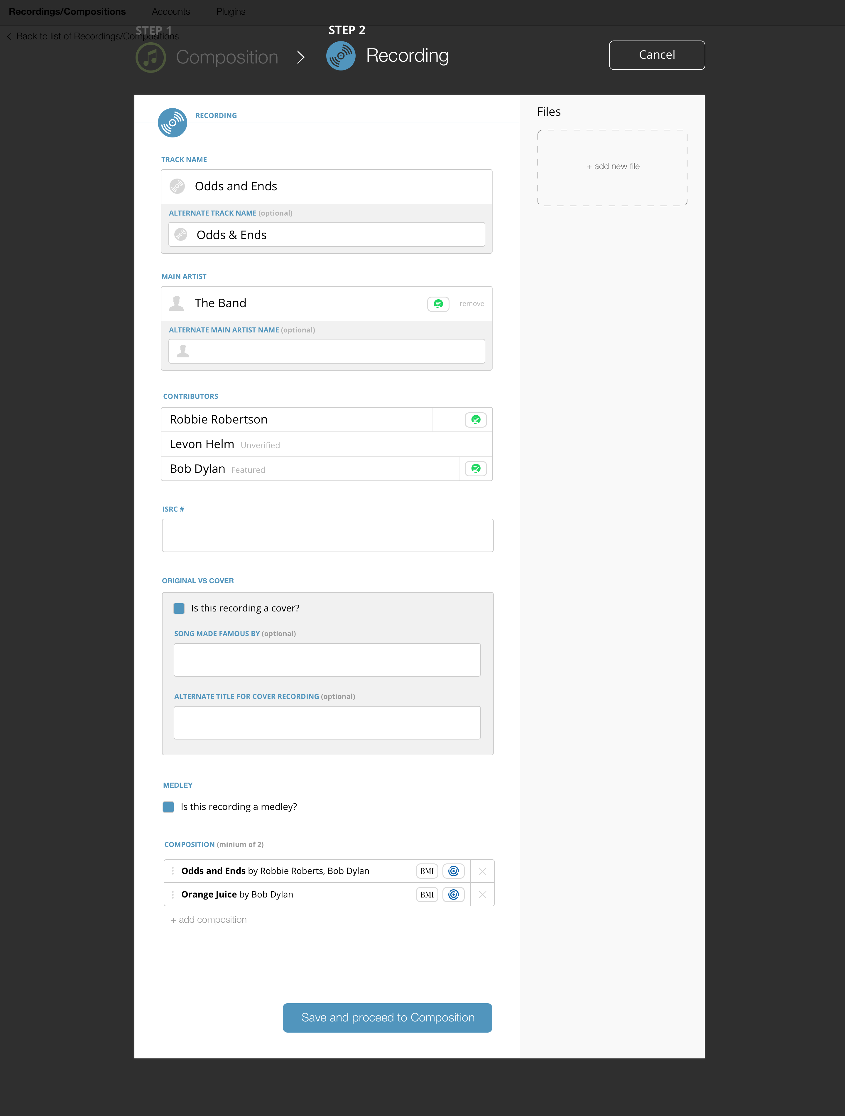
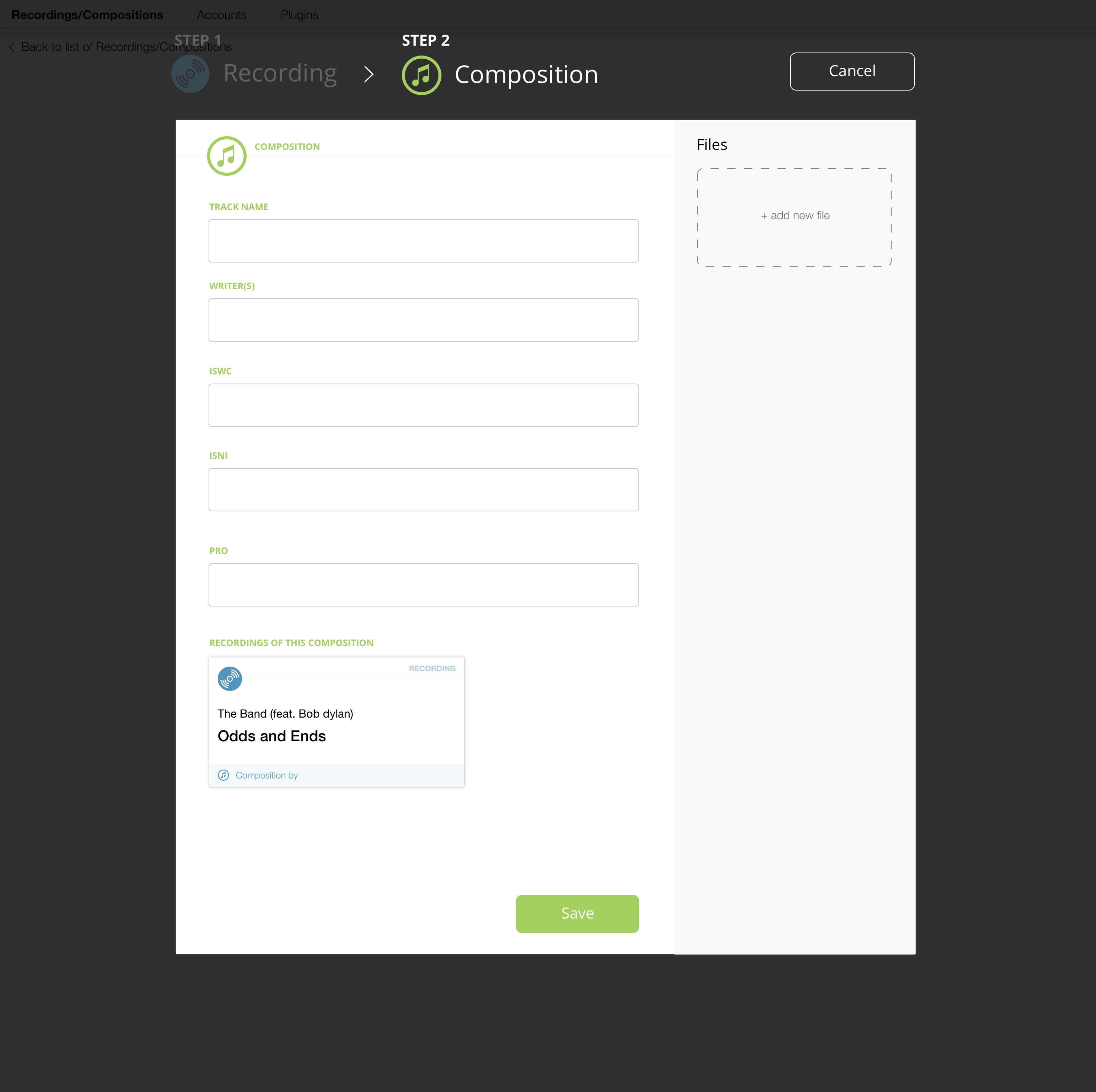
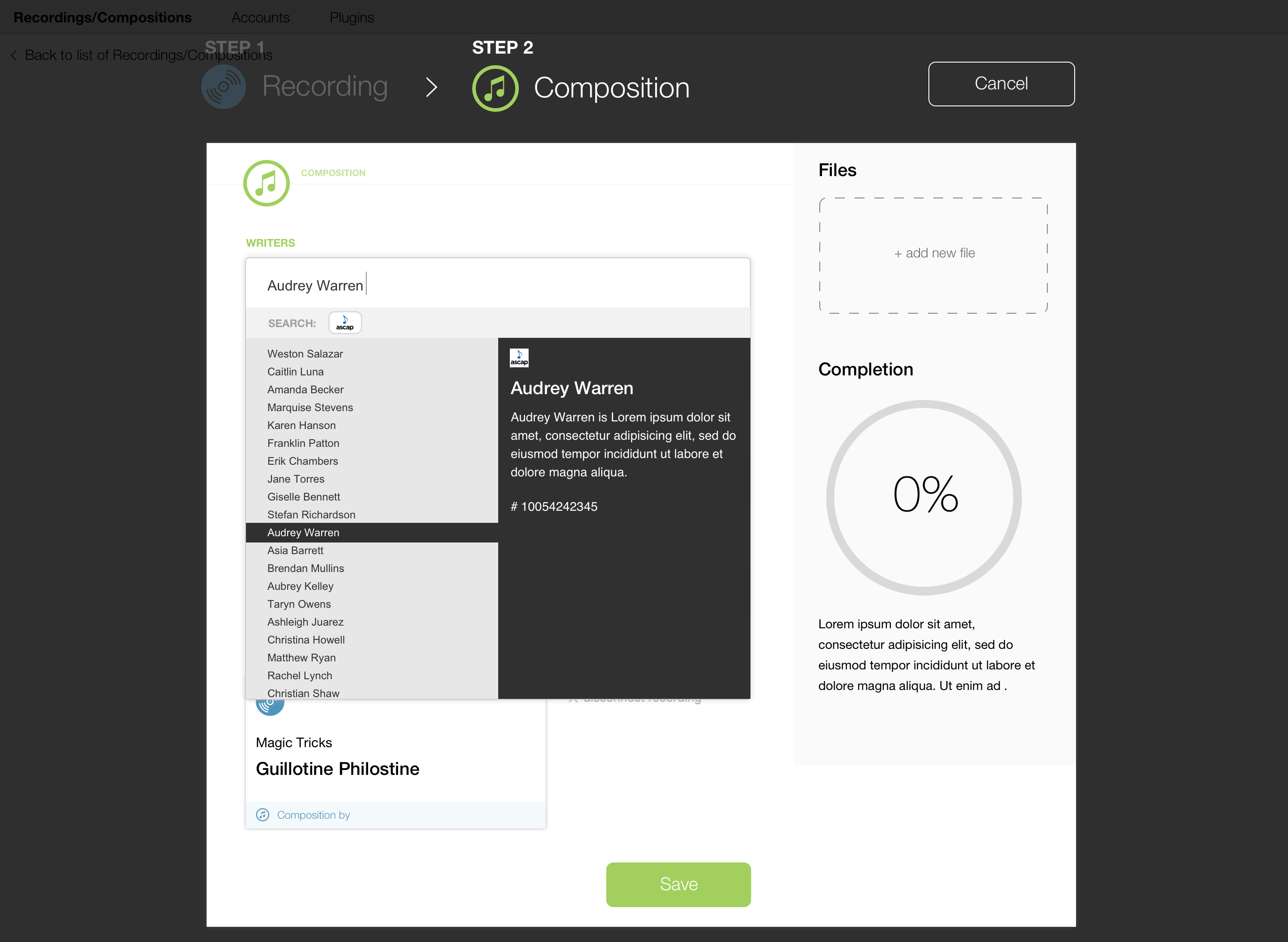
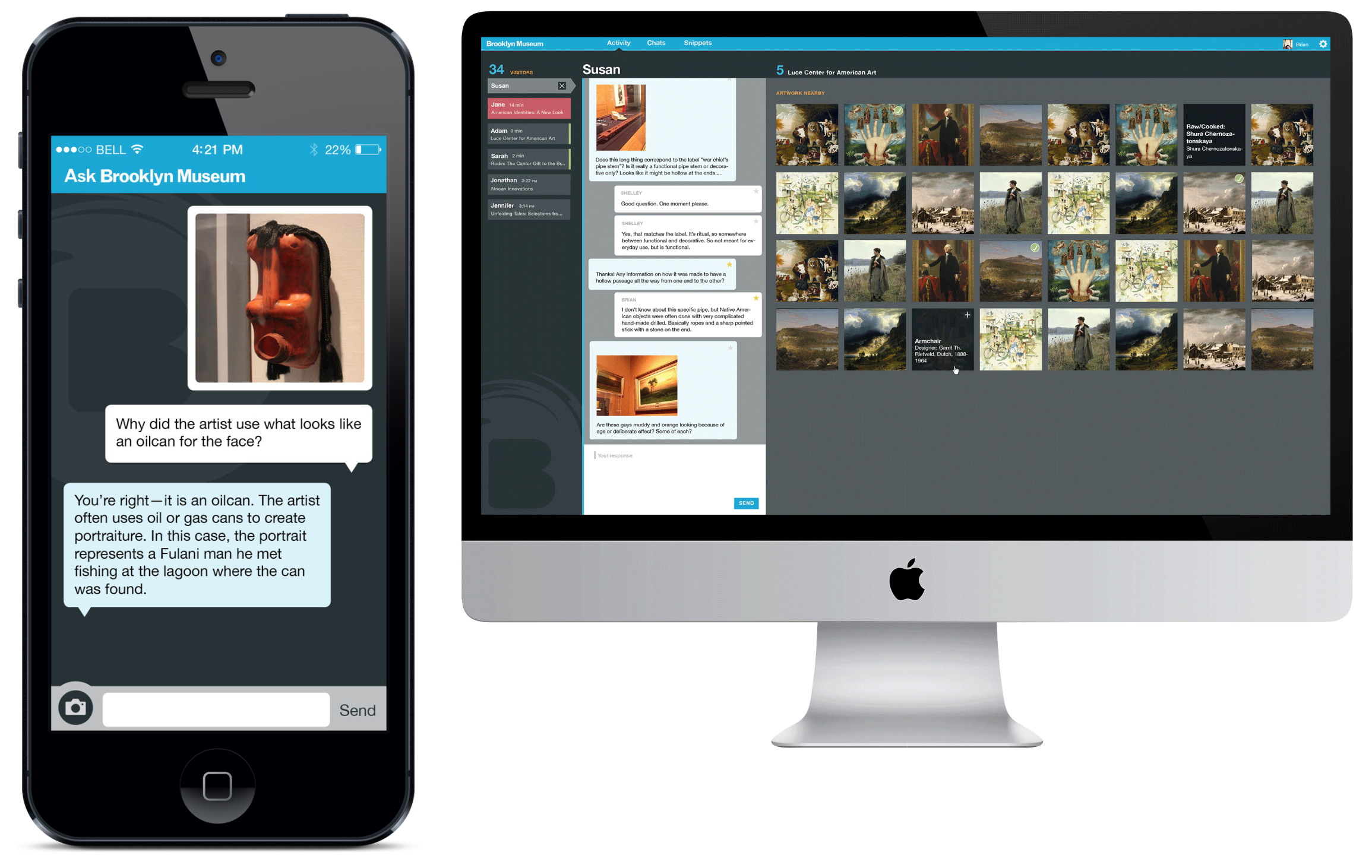
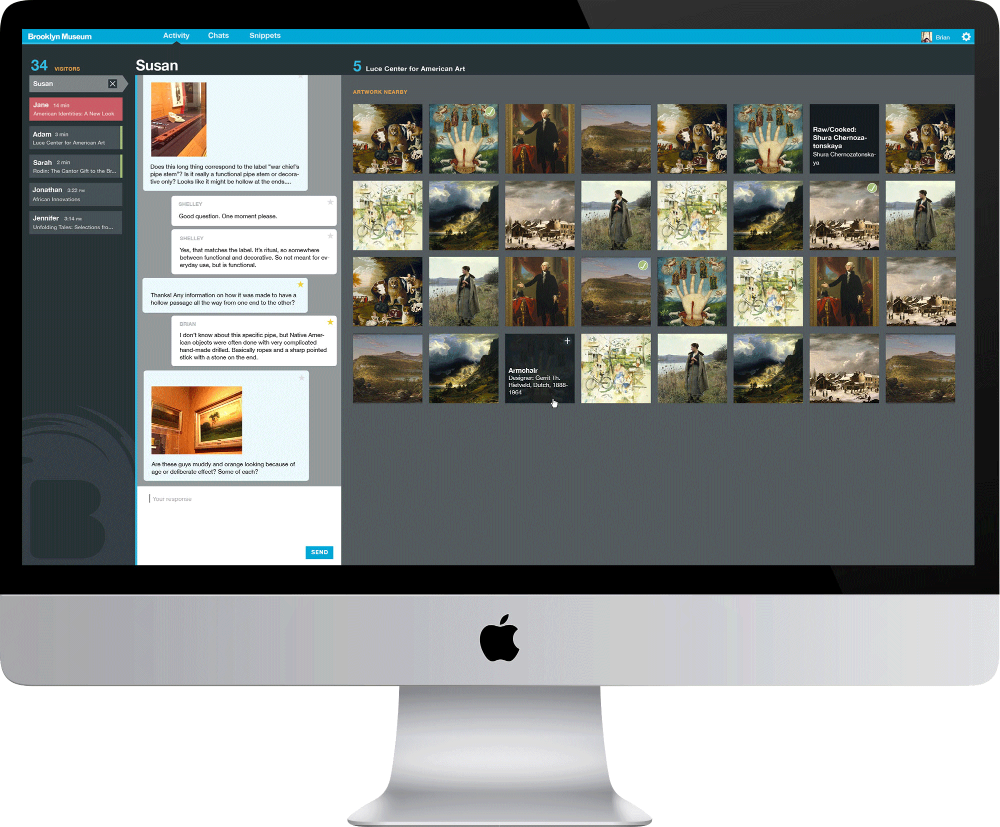
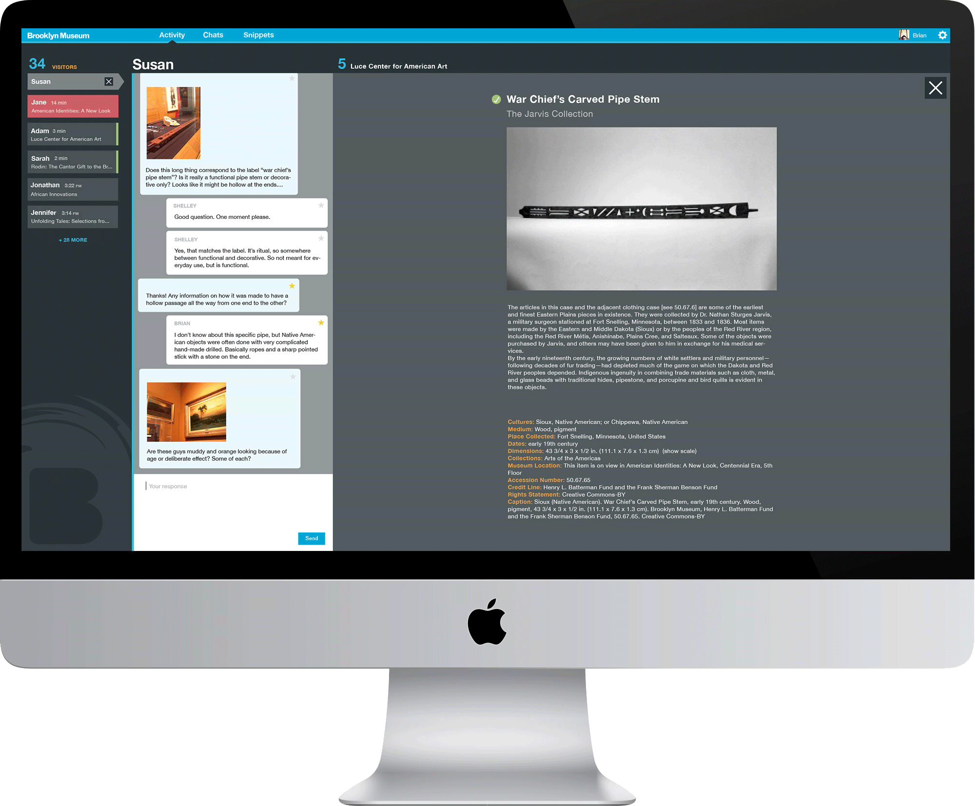
    Ask Dashboard

    The dashboard is still in its infancy, with a modest feature set we know will expand. Our staff can view the list of users currently sending in questions, as well as their location, which is determined by using beacons placed throughout the building. In addition to their location, we are surfacing (in a thumbnail grid) the art nearest the visitor as their questions come in. This gives our staff quick access to those objects and the related information provided by our Collections API.

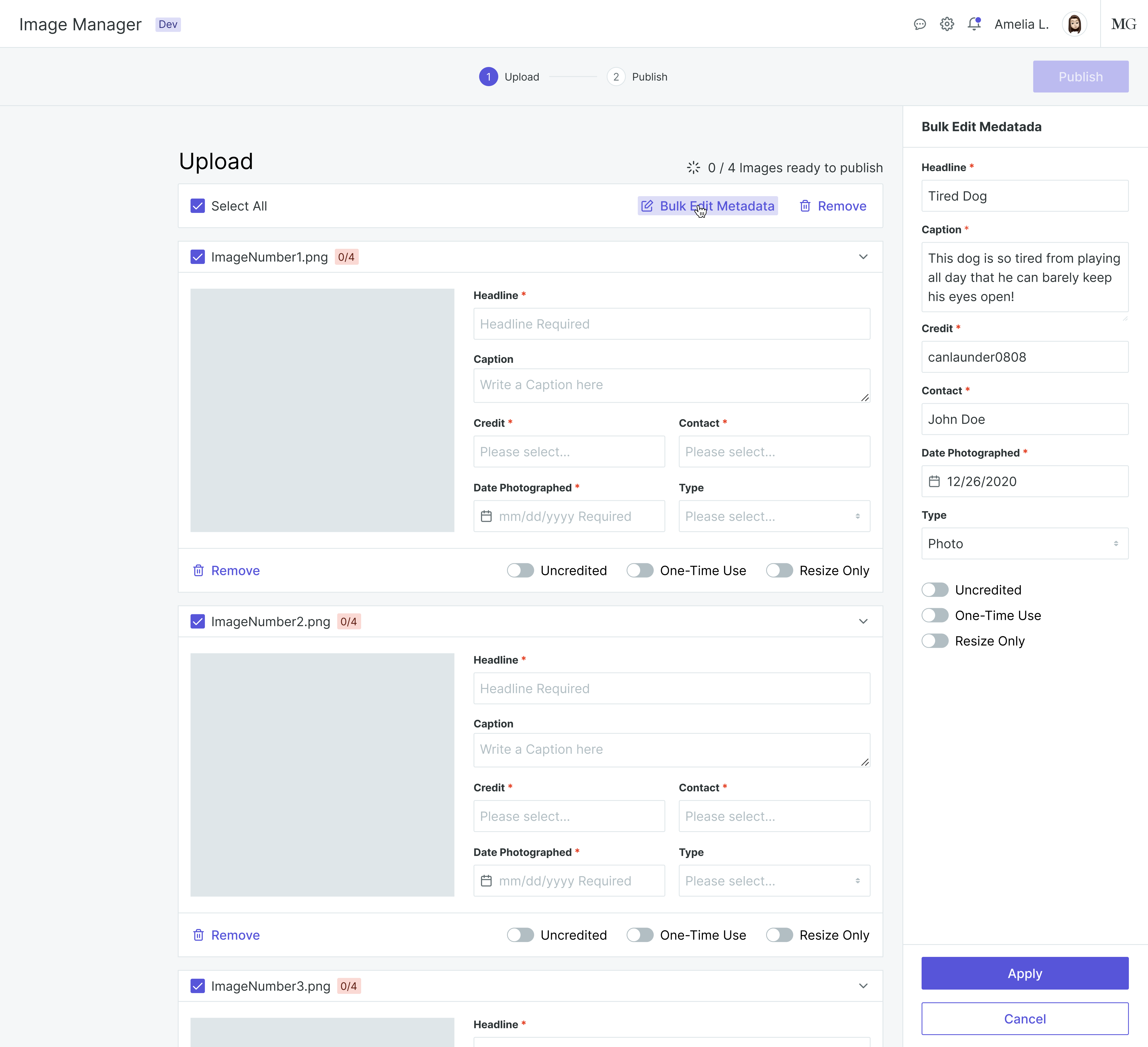
    The web app is designed for internal use only, with a wide range of administrative functions, and will expand as the project expands. It's a control room for adding new accounts for our Audience Engagement Team members, currators, and other admins. It's a searchable database for all the conversations which have taken place, each of which have tons of meta data attached to them. It will be a place to view charts and graphs on things like how many questions our users have asked, how often they ask them, how long the conversations take place, etc. It's designed to grow with us.
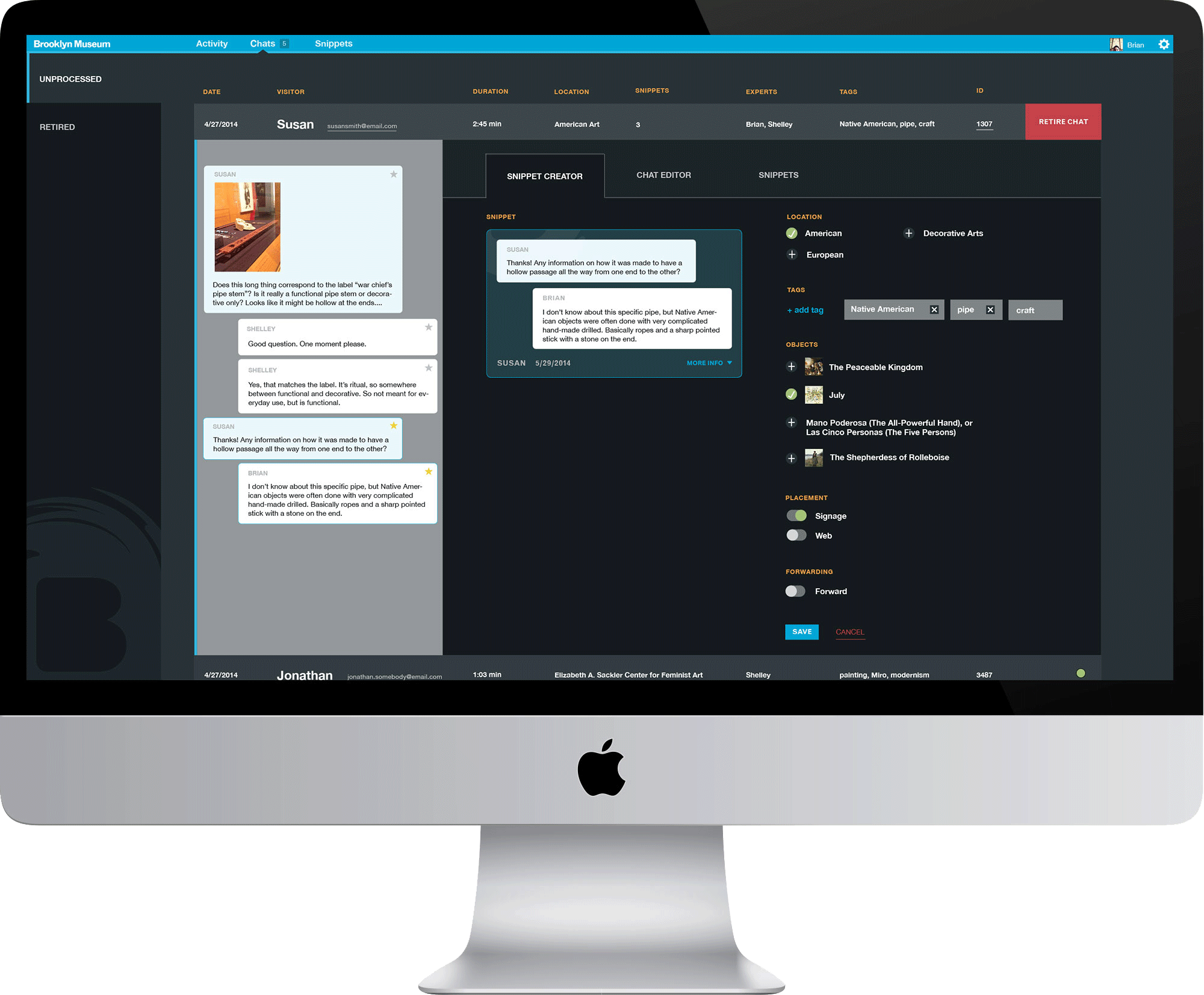
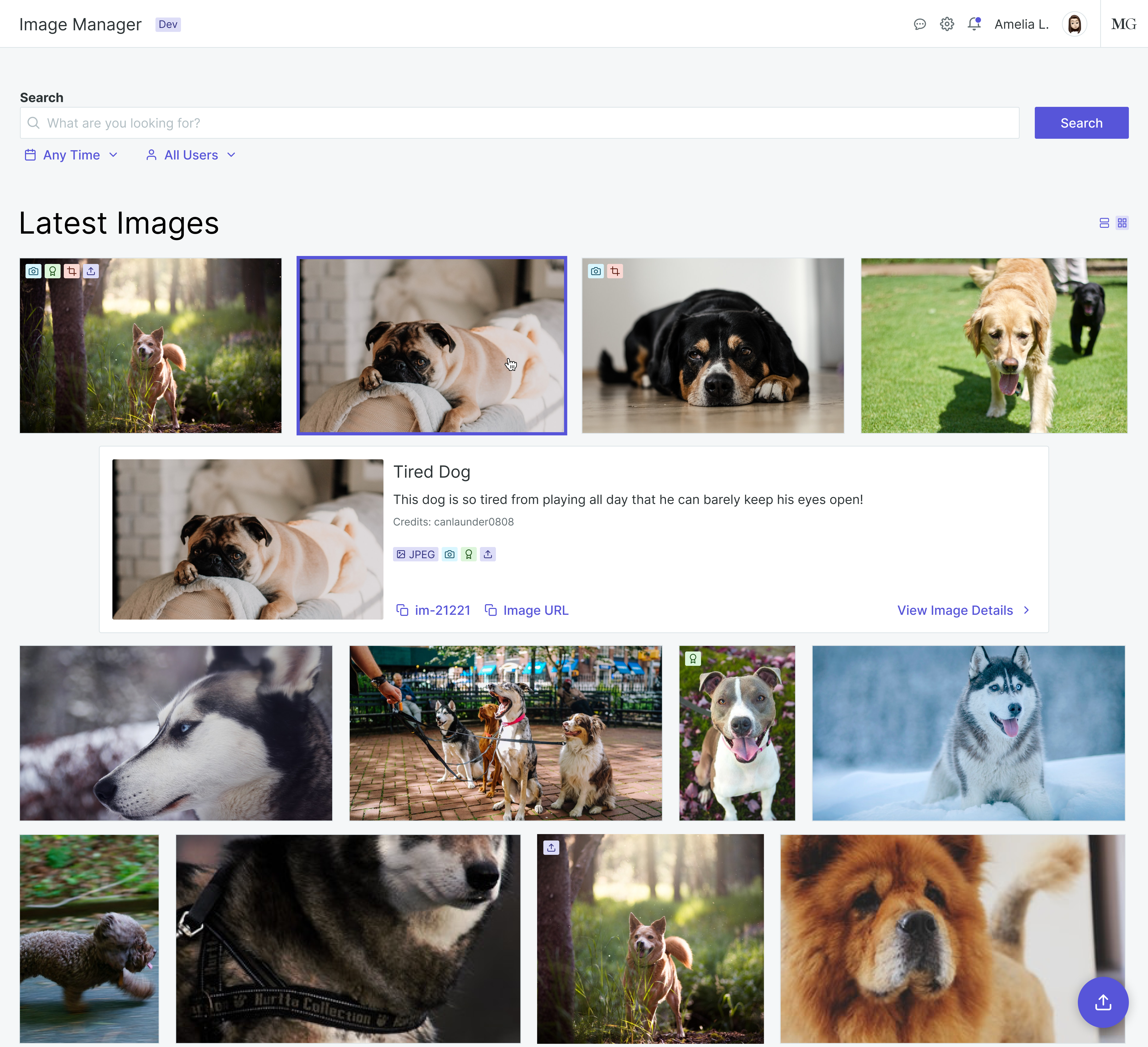
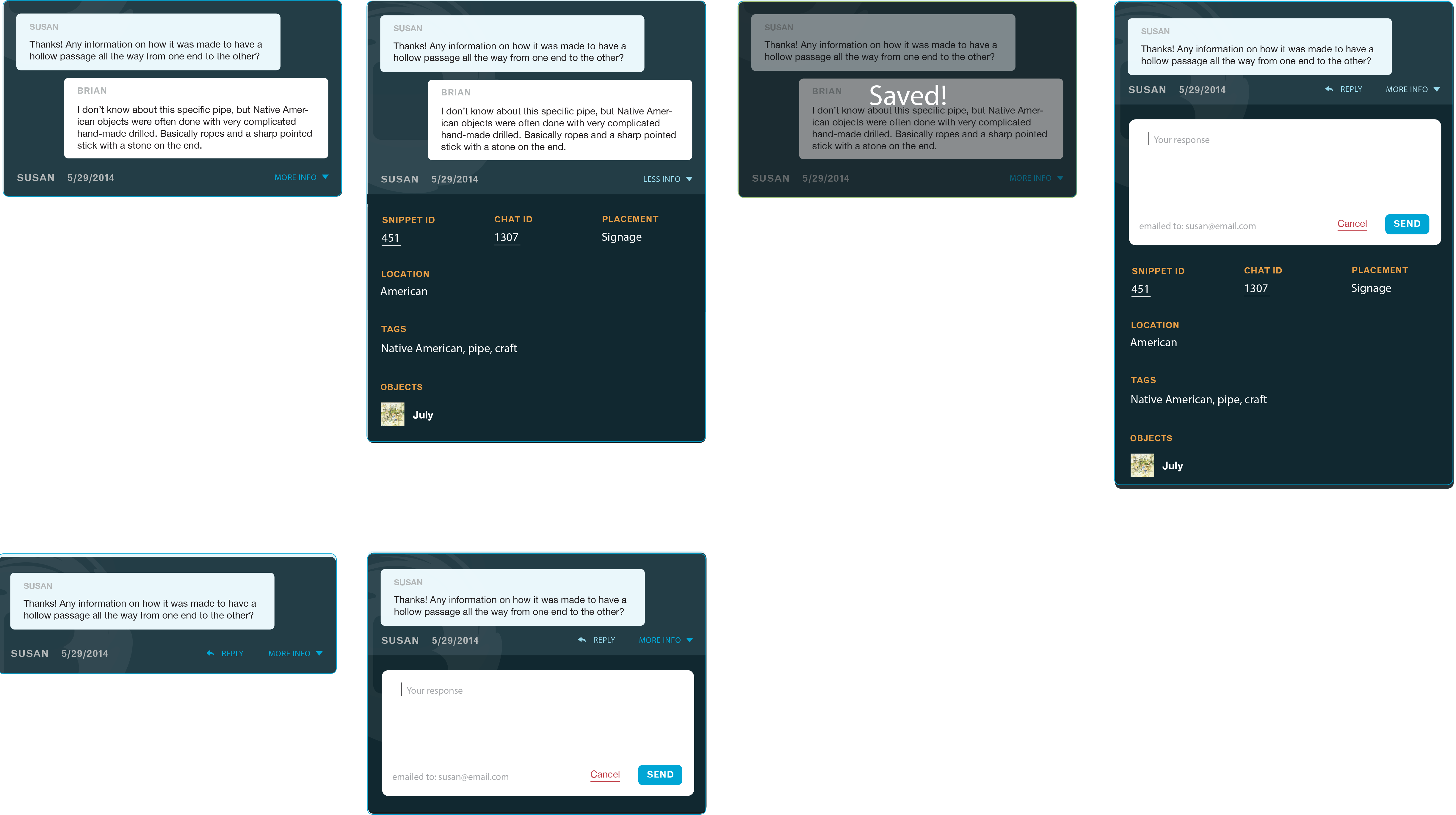
    Snippet Cards

    The snippet cards are one of the most exciting pieces of the Ask app. They provide us with a very effective way of interacting with our volumous data and building something with it. The entire history of chats are stored in a database, and using our interface, we can mine those conversations for choice bits of dialogue. We create snippet cards by selecting the relevant chat bubbles from a chat and attaching further meta data such as gallery location, objects discussed, and tags. Particularly great snippets could someday be surfaced on our website or on digital gallery signage; maybe embedded in a facebook post or on Twitter. Questions our team couldn't answer themselves can be sent via snippet cards to our currators — perhaps also participating artists — who can then respond to the visitors inside the card itself.

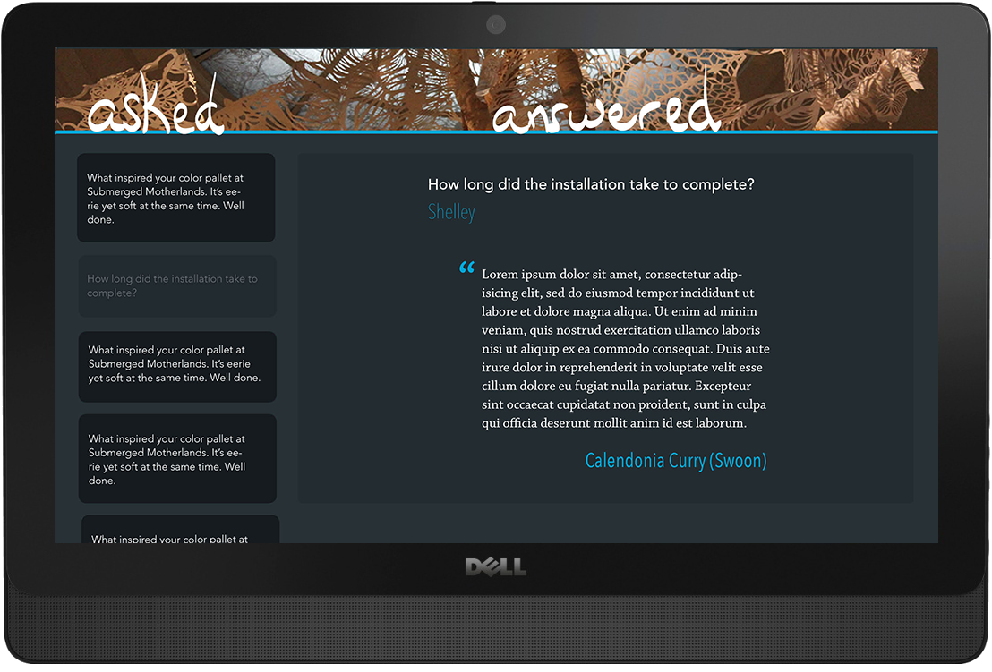
    Gallery Touchscreens

    These are early prototypes. Our intention is to work with an outside agency to design and develop custom touchscreens to be hung throughout the Museum. But for now, we have invested in iPads and Dell touchscreens to test out concepts that could integrate with the Ask project overall. The iPad and touchscreen are hung side by side in each gallery; the iPad for asking questions, and the touchscreen for viewing the responses.

    Concluding Thoughts on Ask

    In the next few years, the museum will be discovering and testing many different ideas for engaging with the data they collect. Our purpose was simple: to better serve visitors while they're inside the museum. Their questions will show where our didactics fail at explaining the art. The musuem's staff will quickly learn which works of art get the most attention — or at least attracts the most questions. They'll learn more about our repeat visitors, why they come back, and what they want out of their experience at the museum. The tools we built during my time there have put them on track towards becoming a museum much more connected to its community than before.

    P.S.

    The Ask logo was changed following the beta launch of Ask in the spring of 2015 and after my involvement with the project had ended. The official launch for Ask was the spring of 2016. Read reviews from The New York Times and The Verge.

BrooklynMuseum.org

Full redesign of the museum's website

  • New museum site CASE STUDY

    From January 2014 until July 2015, I was employed as Web Designer for the Brooklyn Museum. As the sole designer on the tech team, I worked on a host of separate projects integrated under a Bloomberg Connects funding umbrella. My role in each was to direct the design process, collaborate in creating features and functions, and to handle all the UI and UX responsibilities. I occasionally helped with front-end work.

    New BrooklynMuseum.org

    In the spring of 2015, while the beta versions of the Bloomberg Connects project were in testing, we set to building a new brooklynmuseum.org. This new, modern, responsive website is better able to accommodate our visitors. We called this redesign a “refresh” since the site architecture remained nearly unchanged and the content nearly identical as before. Our goals were 1) create a site which better followed the museum's branding, and 2) fix the various navigational problems which had cropped up over the years. A more purposeful website redesign had been tentatively scheduled to take place in the following couple of years.

    Homepage

    The homepage received the greatest change. The old one featured three different slideshows, two of which were for textual content only, as well as an overall lack of elemental hierarchy or content clarity. This new design strips out the unnecessary complications and opens it up with a long vertical flow. The head of the Museum’s Design Department requested only that we leave as much white space as possible, and to refrain from using any rules, borders, or underlines for any delineation. The resulting look is one created by healthy margins and strong typographic control.

    Exhibitions and Collections

    One of the unexpected constraints in designing the new site was the lack of large images. Copyright issues abounded among the collection, which meant many of those images were very small. In addition, the web editors were operating with 2004 web image standards, posting images smaller than necessary. The new templates for exhibitions and collections artworks take this into account.

    Calendar, Shop, and Support

    One of the goals of the website refresh was to create a design which strayed little from the old one. This meant avoiding fancy transitions or fun javascripty things common to modern websites. But I did take some liberty with the calendar header. To match the wide headers we’re using on many other pages, I designed a horizontally scrollable calendar which feels native to mobile browsing. It delineates which days we are closed, hopefully reducing the number of people knocking on the Museum doors on a Monday morning.

    General Notes

    I designed these comps using our own custom typeface, Brooklynesque, which had been drawn for us by 2x4 in 2004. It’s a lovely grotesque, based on Helvetica, which has a friendly and surprisingly diverse personality. Yet, the fonts, being ten years old, were never intended for web use and rendered in browsers in all the wrong ways. We are having them redrawn for modern usages, and will implement them as soon as possible. At the moment, the site is using its fallback, Helvetica.

    This redesign was considered, inhouse, as a “refresh”. There are plans for a more drastic redesign in the following years. At that time — and under the new Museum director — there will be an opportunity to rearchitect the site structure on a content level, rediscover the site’s purpose, and integrate the data and content produced by the Ask project.

November 2012 - December 2013

Front-end Developer at a small design studio focusing on non-profit clients.

Selected Projects

2010 - 2014
Freelancing

Design and Engineering

Designed and built websites for a variety of clients.

  • L-Train Films
  • Fly’s Eye Films
  • 587x286
  • Clay Fain
  • Denizen
  • Kick Republic
  • Wee Beastie
  • Air Master
  • Jon Baker
  • Machine Dream Records
  • Mediander
  • Editor’s Collective

Graphic Design

Posters, advertisements, and product packaging.

  • Isle of Rhodes (band)
  • Hirschen Singer & Epstein
  • Proper Cider
  • Rob Farren
  • Trumpeter Swan (band)